Advanced D3: More on selections and data; scales; axis
Material based on a lecture by Alexander Lex, Scott Murray’s book and the Selection Tutorial, various other examples by Mike Bostock, and Jerome Cukier’s tutorial on scales
Selections and Data
First, let’s go over how selections and data mapping works again. We talked about the selection methods select() and selectAll(), that take CSS3 identifiers. That means that we can select on elements - select("svg"), classes - selectAll(".className"), IDs - selectAll("#cancelButton"), but also other selection expression such as parent child relationships - selectAll("p > span"). Here is a simple example:
So, this is not new, but let’s take a look at the data structure the selection uses:
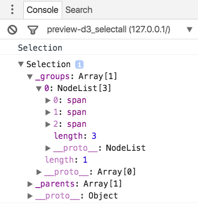
The selections returns a Selection object which contains (among other things) a _groups array, which contains a NodeList. In the NodeList we can see all the matching objects. You can also see that the Selection object has other fields, e.g., a list of _parents.
Mapping Data
When we map data to that object (called a data-join), we can see where the data is stored:
See output in new page.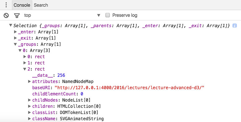
If we look at the properties of the Selection object after we assigned the data we can see the distinct selections: _enter for all data items that didn’t match to a DOM element and are scheduled to be added, _exit for all DOM elements that didn’t map to a data item, and the familiar _groups for the updated selection. When we drill down to the rect DOM elements, we can see a field __data__ that holds the actual data values. We then can access these data values through the first parameter passed into a function .attr("width", function (d) {return d;}). An optional second parameter is the index of the current element, in the order of how they occur in the DOM.
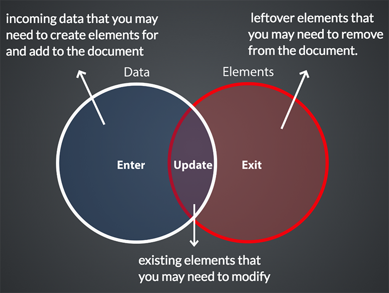
The following figure illustrates the differences between the enter, update and exit selection:
Typically, we want to be able to create visualizations from scratch, i.e., we don’t want to select existing elements but add new ones. We can do this by appending elements to the enter selection:
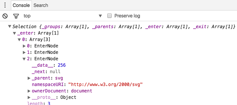
The enter selection right after the data assignment contains an array of length 3 with the generic EnterNode objects. We can see that the data is already bound to those objects.
Next we can use the append() function to assign specific DOM elements to the elements in the selection. Again, we only have to declare what we want to do once, and D3 will take care of the looping for you.
However, the things that we apply to the enter selection, do not apply to elements in the update selection. So, if we for example add a rectangle <rect x="0" y="10" height="10" width="50"></rect> to the above SVG, we will see that the data is not applied to it.
Updating
Here is an example that handles enter and update correctly:
See output in new page.What happens here is that we define what to do when we add something (we add a rectangle and set its class), what happens when we remove something (we just remove it), and when we update something (we apply the new data elements). Notice the call to the merge() function, which merges the enter selection with the update selection, so that we can later set attributes on all the DOM elements at the same time.
Transitions
That’s great, but now let’s look at how we can do this with transitions:
See output in new page.That’s pretty smooth. We initialize new bars with a width of 0 and fade them in as they grow. Notice that D3 interpolates opacity, color, position and size as we use transitions. For removing elements we simply fade them out with opacity.
Groupings: Handling Nested Elements
In many cases we want to apply data not directly to low-level SVG elements, but instead use a hierarchy of elements. For the bar chart, for example, we might want to add a label showing the actual value. There are two approaches to doing this:
- Laying out the numbers and the bars independently so that they match up
- Using a group element to define the commonalities between the bars and the numbers (i.e., the y position in our example).
The latter is the better approach, as we only have to define the common aspects of the group once. This might not make much difference for only labels and bars, but we could also add tick marks on the bar charts, an overlay for highlights, etc. So, let’s try to add groups and take a similar approach to the example before:
See output in new page.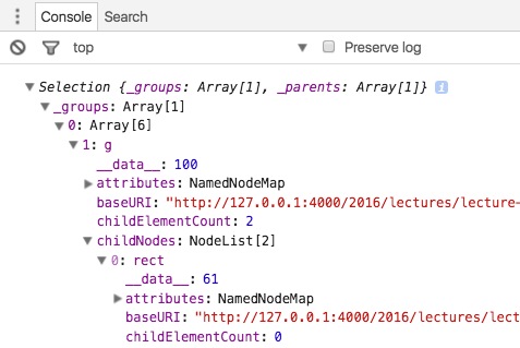
This doesn’t work as we would hope. The update isn’t handled correctly. When we look at the selection we can see why: the data in the g element is updated correctly, but not the data in the rect or the text.
We can fix this by separating the update from the enter and by explicitly selecting the lower-level elements (the rectangle and the text). The selection propagates the data to the actual elements:
See output in new page.Scales
Up to this point, our data has conveniently had dimensions that we could directly plot without applying a transformation. However, in your homework, for example, you used Anscombe’s quartet, and the data there doesn’t neatly match to pixels, so you had to do some manual data transformation. In nearly all practical cases, the data won’t match to the pixels on the screen.
Here is an example of a dataset that is not suitable for direct plotting:
See output in new page.Let’s write a little function that we can call so that this is dataset can be easily plotted:
See output in new page.That’s nice! We could simply do this for any kind of data we have and could achieve our goal. However, the possibility for functions is endless. For example, we could not only do linear scales, but equally do logarithmic scales, power scales, discrete scales, etc.
And we don’t always want to write output in screen coordinates, we could equally want to vary the saturation of a color, etc. Finally, we could have ordinal data (we’ll talk about data types in one of the early theory lectures), or temporal data. So you can see that there are many possibilities to transform your input data to achieve a particular visual mapping. Fortunately, D3 provides a set of powerful scales:
See output in new page.Here we’ve successfully used a linear D3 scale. There are a couple of new things here. First, we create a scale of the linear type with the call d3.scaleLinear(). Next, we define the input domain and the output range. The domain defines the values that we expect in our dataset. Here we chose to use an input domain starting at 0 and up to the highest value of the dataset, which we can conveniently determine by using D3’s d3.max() function. We could use d3.min() to define the lower bound of the range, however, that would mean that our bar-chart doesn’t start at 0, and this is something that we will learn is almost always bad!
The range defines which output values we want from the scale, i.e., we’d typically pick something that we can easily use to draw on the screen.
Clamping
What happens when you plot a value that’s larger than your domain? When it’s feasible, you will get a value based on your mapping function, but it will exceed your screen coordinates. There is a way to avoid overplotting, by using clamping, i.e., by manually assigning every value larger than the extend of your domain to the maximum value of the domain. This can be very helpful, but should always be done with care: you need to highlight that you’ve broken the scale somehow, e.g., by using a label or a special color.
See output in new page.Color Scale
The next example shows how we can use a color scale to redundantly encode a bar chart with positive and negative values:
See output in new page.Setting the color scale is very convenient. We simply define a range of three points, the minimum, zero and the maximum, and identify the three corresponding colors (darkred, lightgray, and steelblue) in the range definition. When calling upon the scale, D3 will interploate between the colors for you.
Axes
Drawing Axes and legends is critical for data visualization. All of our examples, with the exception of the labelled bar charts, didn’t really tell us about the size of the data. However, drawing axes well is a lot of work. Fortunately, D3 has extensive support for axes. Here is an example based on our previous bar chart:
See output in new page.This worked! We create a new axes by calling d3.scaleLinear() and tell it its value range by passing the relevant scale. We then append the scale to the svg with this call: svg.append("g").call(xAxis). Now, we can see that it’s not very pretty, that it overlaps with our bar charts and that some of the numbers are truncated because they go beyond the svg. To fix this we have to style the chart and add some margins.
This is a much nicer bar chart! We’ve used CSS to style the axis, the nice() function for the scale to get round axis labels, introduced a padding and a background for the chart. Of course, this chart doesn’t react appropriately to updates, but we’ve seen before how that works.
More Complex Data
Up to this point we have only worked with one-dimensional arrays. Here is an example on how to handle arrays of objects, where each object has multiple values. We have three types of values: products (labels), types of products (categories), and tons (numerical data). We’re showing the data in a colored bar chart, where the color corresponds to the product type and the bar width to the tonnage. In addition to that, you can sort the bar chart based on the three data values: alphabetically by type and product, numerically by tonnage.
Among the new concepts introduced in this example are:
- How to access data in objects.
- How to sort data.
- How to properly deal with padding in an SVG.
- How to use a scale with bands to evenly space the bars.
- How to update a scale.
- How to ensure object consistency for transitions with the key function of the data mapping.
- How to use the object notation to define many attributes at the same time.
An alternative to the sorting as used here would be to use D3’s sort feature for selections.